Thursday, 20 June 2013

Interesting website for artists and exploring installation ideas to do with the floor:

http://pinterest.com/cimcnamara/on-the-floor/

Artists and ideas I found interesting:

1) Artist : Elana Herzog

- decaying process
- dematerialisation
- deconstruction, reconstruction
- cheap, tacky discarded household items, carpets and fabrics


2) http://www.lostateminor.com/2011/03/24/yarn-meets-potholes-a-different-kind-of-street-art/

Yarn Meets Potholes: A Different Kind of Street Art

Who doesn’t know them? The cracks in the roads that make driving and walking way less comfortable? Juliana Santacruz Herrera has had the funny idea to turn these unwelcome side effects of ‘nature at play’ into something more pleasant by filling the gaps with bright and colorful strands of yarn. Juliana currently fills potholes in Paris. Although her work might not be for eternity, it surely inspires some Parisian passers by to smile.


Artist: Jan Vorman‘s He uses Lego to fill in holes left from the war in Berlin and does similar installations in other places around the world


3)Tamiko Kawata - safety pins - from ordinary to extraordinary
continuous line, creating an environemtn by hanging the saftey pins, delicate and light presence, a space which denys access

 
 Rain Forest/SUNY 18’x45’x12’ Safety pins 2000

4) Polly Apfelbaum: Polly Apfelbaum’s new installation spreads dyed bits of velvet over the floor of D’Amelio Gallery in Chelsea in New York. We ought to be able to dismiss Apfelbaum’s works as old-fashioned, self-absorbed abstraction, fiddling about with color and form – that’s the world she came out of in the late 1970s. But there’s something about her trademark shift to the floor, and the contingency of her scattered parts, and her links to the history of textiles and crazy-quilting and all kinds of women’s work, that guarantees the continuing freshness of her installations. Somehow, ending up on the floor surrenders the ponderous authority that still clings to pictures on walls – maybe because there’s a sense that we could mess the work up if we wanted to, and yet choose to leave it unstepped on.

Wednesday, 19 June 2013

Working towards talk week:

- artists that have helped my make decisions on how to install my work and put my ideas successfully across to the viewer.


Looking at intensity of installation, labour, time, materiality: artists Anu Tuominen (chrochetd house hold pot holders) Tara Donovan, Motoi Yamamoto (salt installations)
Tara Donovan:
accumulation of everyday objects /materials - ordinary objects into art
Video: Tara Donovan: sculpting everyday materials
lookign at materials that are easily accessible, mass produced, have a low profile (no distinct markings or colours), reflective or translucent
She works with them until they transcend into something else, there is a bodily experience with the finished product
she approaches these materials in a methodical way like a scientist
 cleaning up and isolating the materials in a space, then treating the installations/ sculptures like drawings and allowing them to evolve through a playful and experimental interaction with the materials.  
art is different for everyone, the experience the viewer has and the artists view and approach to art - Donovan's intention is to see what she can discover about these materials and test what see can push them to become..
understanding the material you are working with and relying on the nature of something. Donovan is mimiking the ways of nature not necessarily nature itself. 
Tara Donovan, installation artist out of Brooklyn, New York, creates pieces made out of everyday ordinary objects like drinking straws, cups, fishing wire and paper. These simple objects when are then transformed into amazing textural and topographical works of art. The individual object then is almost no longer recognizable in it’s original form but has taken on a new life form. The installation in the image above feels like some sort of life form bubbling out of the ceiling, reflecting light in different ways throughout the form. But the piece is made simply with a sea of styrofoam cups and hot glue.
 
                                                  Tara Donovan, "Untitled,"2003, styrofoam cups and hot glue
 
 
                                                        Tara Donovan, "Untitled," paper plates and hot glue.

Motoi Yamamoto’s, Salt sculptures:


His colossal works can take weeks to complete, and the intricacy and sheer scale requires incredible patience and a slow, steady hand.

 - continuous line
 - going with the pattern and following his intuition
 - mapping out the space - working into the given space 
 - his works are delicate, temporary and have a prescious quality - through the scale, labour, material, and imagery the works create a bodily experience for the viewer to appreciate and the installation gains a sense of vlaue and importance through Yamamoto's specific installation choices.


Yinka Shonibare:

 
"Line Painting," 2003
Emulsion and acrylic on Dutch wax printed cotton, and painted wall


Yinka Shonibare was born in London in 1962 and moved to the Nigerian capital of Lagos when he was just three years old. He studied at the Byam Shaw School of Art, London in 1984-9 and completed a BA at Goldsmiths College, London in 1991. Shonibare considers himself ‘truly bi-cultural’ and strives to open up debate about the social, cultural and political issues that shape our histories and construct identity. His works challenge assumptions about representation by playfully blurring the boundaries between stereotypically Western ideas about ‘high’ art and traditional categorisations of ‘African art.’
He is best known for his use of colourful batik fabric, which he buys from Brixton market. Labelled as ‘African’, the fabric actually originates from Indonesia; it was introduced to Africa by British manufacturers via Dutch colonisers in the nineteenth century. Shonibare uses the fabric as a metaphor to address issues of origin and authenticity and to challenge straightforward readings of his work.

In Maxa 2003, Shonibare substitutes the canvas for small regimented circles of ‘African’ fabric that are decorated on the front and sides like icing on a cake. These perfect circular forms create visual chaos and offer a political challenge to ideas about taste. The problematic history of the fabric undercuts the visual pleasure of the patterns as the work becomes a metaphor for excess and exploitation. Shonibare creates ‘high’ art from commonplace cloth, asking us to consider the excesses of commercial decadenceand its relationshio with third-world exploitation.
I love his concept and how he use the fabric material as a metaphor of his concept showing that our culture identity is never again pure.

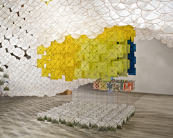
Finding Patterns | Jacob Hashimoto
“Plunk” (2009), by Jacob Hashimoto


"Untitled," 2002, Jacob Hashimoto


Jacob Hashimoto, Acrylic discis, Rhonda Hoffman gallery, Chicago


If artists Yayoi Kusama (she of the polka dots) and Yinka Shonibare (he of the African fabrics refashioned into some kind of Western icon of art history) had a love child, it would be Jacob Hashimoto. While both Kusama and Shonibare are having blockbuster shows at Gagosian gallery and the Brooklyn Museum respectively, the tapestries of Hashimoto quietly hang at Mary Boone. (Kusama, who is celebrating her 80th birthday this year, also has a show up at Victoria Miro in London.)


The Brooklyn-based Hashimoto makes small “kites” — hexagons made from bamboo and layers of colored rice paper — and suspends them with nylon fishing line to create kaleidoscopic wall hangings that shimmer and cascade as the vistor passes by. Some suggest video games, vistas and 1960s-style wallpaper. With haiku-style titles like “Awake Under the Huge Starry Sky” and “Cutting Stems in the Oxygen Garden,” the works are ethereal. If you miss Hashimoto at Mary Boone, (the show closes June 27), you can check out his work at Otero Plassart in Los Angeles, starting September 12.

Looking at:

- layering
- colour
- bodily experience with the viewer in relation to the installation of the work and how it reveals different qualities and ideas in the work as the viewer interacts with it.
- scale - how this changes the viwer's experience and relationship to all of the smaller elements that make this larger scale installation - creating an environement...interacting with the space
 

Thursday, 13 June 2013

Few ideas from Tom Friedman:


-          ‘magic out of the ordinary’
-          ‘unexpected beauty’ – these items are so ordinary but through playing with their material strengths and working with my intuition on colour combinations and textures, different layers of interest and beauty emerge.
-          Simple but interesting and beautiful manipulations that lend the work brevity and authority.
-          Bringing the viewer’s attention to these everyday objects, encouraging them to re consider their relationship to these objects and other ideas that they may reference for the viewer. 
 -      Using my intuition – avoiding too much planning in my choice of materials
 -   Continuing to play with the idea of simple manipulation or totally transforming these objects to consume their original purpose in the everyday...
-         Manipulating these everyday objects and reassessing them... heightening their authority as now being considered ‘art’
-          Putting the viewer into a zone of contemplation
-          Partially manipulating them...or making personal manipulations/ alterations – changing patterns, construction, and rhythms found in the original objects.
-          References the ideas of deconstruction and reconstruction
-          Conversation between the two - the original constructor and me the de-constructor and then reconstructor.
Value:
-          investment of labour  and time into something adds value...something grander than it is in the sense of value...it becomes ‘art.’
-          it adds value when it makes connections with something else beyond it..
-          the materials gain a new importance.
-          Creed.... “the understated and the ordinary, things that were over-heard and changed us, cheap familiar materials played with to implode meaning and context.”
-          creating works where my process and the material choices I  have made unfold when exploring the work. The viewer can experience this journey through my deliberate display of layers in each specifically crafted work.
-          The critical theorist, Theodor W Adorno stated that “if the use value of things dies,” these alienated and hollowed-out objects can come to be charged with new subjectivity. While the things become “images” of subjective intentions, this does not erase their thingness: dialectical images remain montages, constellations of alienated things and meaning.” 
Collecting everyday garments: Op shops, K rd


2013 Talk week installation progress:
1st exploring colour combinations and materials:
 
Further development: layering unravelled found materials, showing my journey and and gathering thorught the layers


Sunday, 9 June 2013

Looking at artists who use recycled everyday items:

Hosmer, Katie. “Colourful Wall of Crocheted Everyday Items”. My Modern Metropolis, blog. May 11, 2012. Accessed June 7, 2013. http://www.mymodernmet.com/profiles/blogs/anu-tuominen-crocheted-potholders

"Colourful Wall of Crocheted Everyday Items"


This colorful installation is a collection of crocheted potholders by artist Anu Tuominen. In much of her work, the Finland-based artist redefines the function of basic, everyday stuff. She finds neglected and unloved goods, and by reworking these things, she gives them new life as conceptual art.

As a collection, this crotched wool, formed into a colorful pattern of basic household potholders, functions as a strong visual language. In a review of her work, Ostso Kantokorpi says, “Tuominen’s works present an endless array of parallels, analogies, continuums and hierarchies. She transposes the image into words and the word into images, the public into things private, and the private into the public.”

Tuominen looks at the world with an open mind. She sees the beauty in what others would see as trash. Through this visual attention to the world, Tuominen is able to demonstrate the importance of innovation, even through the smallest item like a piece of wool. She says, “Everything is still as it was, and yet somehow more meaningful than before.”
 
 - I am very interested particularly in the idea of paying attention to small everydya things in the world and bringing them into conversation with the viewer, for their purpose and references to be considered, and their importance and authority as 'art' to be questioned
 - I am not concerned whether as an aritst I give the objects I have chosen a new specific meaning, I am more concerned witht he idea of bringing mundane objects into view and contemplating their ability to be or reference something beyond what their origional everyday purpose grounds and limits them as.
 - reassessing the everyday
 - the world is there to be engaged with
 - rehabilitation

 - process - mindless, labour, time

 - creates a conversation between the two - the original constructor and me the de-constructor and then reconstructor.

 - investment of labour into something adds value...something grander than it is in the sense of value...

 - it adds value when it makes connections with something else beyond it..


Anu Tuominen, "Colourful Wall of Crocheted Everyday Items," household pot holders 


Interesting Articles: Martin Creed

Article to read:

Avgikos, J. (2007), Martin creed. Artforum International., 46, 368-369. Retrieved from http://ezproxy.aut.ac.nz/login?url=http://search.proquest.com/docview/214342421?accountid=8440
 
Besides the borderline arrogance evident in gestures so slim as to call into question their value as art-Work No. 79: Some Blu-tak kneaded, rolled into a ball, and depressed against a wall, 1993, for example-there were extended quiet moments. Monochromatic works on paper produced by simply filling all the space with marker or highlighter ink were hung throughout the exhibition, as were a number of spare-looking pencil drawings. Both series attest to a singularity of focus akin to the meditative act of marking and re-marking a spot. All of them are flukes of a kind: unique, but related in their differences. Banality is an important, considered aspect of Creed's production, present throughout as an aspect of a critical-but oddly entertaining-restraint.
 
Martin creed, artist. (2011, Jun 18). The Independent. Retrieved from http://search.proquest.com.ezproxy.aut.ac.nz/docview/872305288?accountid=8440

Celebrity doodle
QUOTE:
"A doodle is a drawing you make when you're not really aware of what you're doing. So you've got all those lines scrabbling around - I didn't know what I was doing, I was just filling up space. The best type of work is when you're not fully in control. There's a tendency to try to control and that can kill things. It's like searching for something you can never find."
Martin Creed is a Turner Prize-winning artist. His dance piece, 'Work No 1020', is at London's Sadler's Wells on Tuesday. His doodle is 'Work No 897'
 - A lot of the time in my works I do like to control the outcome. Creed's idea of not being fully in control has only made me think more about going with my intuition and following my first instinct when selecting everyday materials to work with and how to make work from them.
- try selecting items instinctively and on feeling - bringing objects and things together in ways that I may not even understand why but will generate interesting conversation about the choices, object relationships and ideas beyond just their everyday purpose.

Article: "Much ado about nothing: Why Martin Creed is the master of minimalism."

Greer, Germaine. “Much ado about nothing: Why Martin Creed is the master of minimalism.” The Independent.(2010). Accessed June 7, 2013.


If nothing is enough, why have any more? The difficulty is that nothing cannot be achieved. We might well be satisfied with nothing, but we can't get hold of it. Everything is something. Every gesture, however we strive to empty it, is loaded. The aim of minimalism in a universe of loaded gestures is to arrive at the emptiest possible gesture. A minimalist masterpiece is a gesture that successfully resists being loaded. Though hoo-ha and hullabaloo may greet its appearance in public, the minimalist masterpiece will retain its utter purity. The truly successful minimalist work is one that can be neither bought nor sold. The lights going on and off is the ultimate uncollectable. It can't even be photographed, let alone reproduced. You can't stick a poster of it on your wall to show how hip you are. All of which is obvious, like the blueness of the sky, but, like the blueness of the sky, not understood.

Minimalism is not new. As a movement, though it may not always have been called such, minimalism has already lived a whole century, longer than Impressionism, Post-Impressionism, Cubism, Expressionism, Modernism, Futurism, or Surrealism. Malevich is still a hugely relevant artist, though most of his admirers could not tell you why, which is as it should be. The lights going on and off is a lineal descendant of Alighiero Boetti's Yearly lamp (1966), a light bulb that would be illuminated only for a random 11 seconds in any year, hidden in a box. What we should probably infer from the longevity of minimalism is that its possibilities are far from exhausted. If Kant is right to define the object of aesthetic judgment as an object with no ulterior purpose, use or function, all art strives towards minimalism but is usually deflected by the conditions in which the work exists, by patronage, politics, established religion or the artist's personal ambition. Art that invokes moral values, that tells a story, that engages with actual events, that has become a trade object, has already compromised its art-ness. When a minimalist work becomes so embedded in its own reputation that it is treated as a symbol denoting a mass of notions that are essentially nothing to do with it, it is no longer minimalist. The gesture is then overloaded with purport and overwhelmed, its playfulness extinguished.
The success of Martin Creeds work: "Light on and Off"...

Art being a part of life, the threat of such extinction is ever-present. Nature, as distinguished from art, abhors a vacuum. The beholder, having decided to experience The lights going on and off is not about to confess to experiencing nothing as she stands within its space. The artist's gesture will be filled with something, even if it is only the beholder's awareness of her pupils' expanding and contracting out of sync, or her disappointment, outrage, or delight. As one who was delighted when Martin Creed won the Turner Prize in 2001, I have to admit thinking very hard all the time I spent in the room at Tate Britain, as the lights went on and off, about the unnecessary lengths artists go to to dramatise spatial relationships, about light as their true medium, about the space being one living cell pulsating within the art establishment mausoleum, but also that I didn't need to be thinking about such things at all, or thinking at all, the sheer gratuitousness of the gesture, the luminosity of its total pointlessness was as near to perfection as human achievement ever gets. The blue of the sky is the blue of utter emptiness.

Most of the male American minimalists with whom the movement is usually identified have packed too much ego into their work for it to survive as minimalist. It is when we consider the work of women like Agnes Martin and Eva Hesse that we draw closer to the still centre where ego has been eclipsed, and to Creed. Martin's humility, all of whose ways "are empty", is close kin to Creed's egolessness; both are rare in any artist since the Renaissance. Creed's response to Martin's soft grids can be seen in works like Nos. 461, 472 and 557. Martin was influenced by Indian tribal art, and it is a curious coincidence that Creed's haptic approach to filling his A4 picture space with contiguous lines arrives at a minimalist version of the classic Pintupi images of the straightening of spears. In Work No. 175: Two drawings, Creed's homage to Hesse is touching and transparent, but her spirit can be sensed more subtly elsewhere, in Works Nos. 83, 263, 264, 340 and 384, for example.

Like Hesse and Martin, Creed avoids the regimentation and machine-made regularity usually associated with minimalism; when his felt-pen tracks across the page it obeys the pressure of his hand and arm. The result is organic rather than geometric. As for self-glorification, Creed has evaded it even more successfully, because he has made works that have no signature and do not even require his agency. Given his meticulous instructions, anyone could install a version of Half the air in a given space (Works Nos. 200, 202, 268, 360). Whenever and wherever Half the Air in a Given Space is installed it is a different work; Creed does not insist on controlling every aspect of it. Neither the balloons nor the people among them behave in predictable ways. When for once Creed capitulated to the pressure to show that he could draw, he drew a doodle with a marker pen (Work No. 438), as Hesse might have done, but it is a perfect doodle, a super-doodle that he must have practised a thousand times. The marker pen travels six or seven feet with unvarying pressure on point and paper as it swiftly describes a spiral of nine coils and the four pinnacles within the spiral. Easy, when you know how. Making it look easy is part of the minimalist project; the fun part is what Creed has most strikingly in common with Eva Hesse.

Creed's struggle for emptiness never ends. He strives for utterances that will not yield an ulterior meaning to even the most dogged (mis)interpreter. How difficult this can be became apparent from Creed's 2006 project for the Fondazione Nicola Trussardi in Milan, which was called simply 'I like things'. On the face of it, the Palazzo dell'Arengario was a perfect site for the installation; the smooth blankness of its pared-down Neo-Classicism is justified by the same Platonic authority that underpins Creed's formalism. However, the values projected by the Palazzo dell'Arengario, which was designed by a committee of Mussolini's favourite architects in the late Thirties, are not so much formalist as Fascist. The building brought its own tragic personality to the event, and the work was inevitably corrupted by it. The lights going on and off was installed in the Sala delle Colonne; this time instead of remaining on for five seconds and then off for five seconds, the lights were on for a second and then off a second. People entering the space were buffeted by a wind machine; members of the Road Runners Club of Milan occasionally dashed past them. When "one of Martin Creed's iconic works", the slogan "Everything is Going to be Alright", which had been mounted in Times Square in 1999 (Work No. 225) and dozens of places since, was replicated in white neon across the façade of a Fascist building that was damaged by Allied bombs and never officially opened (Work No. 560), its insouciance was penetrated with so much painful irony that, like the whole show, it turned conceptual. Conceptualism is the obverse of minimalism; it deals in proliferating meaning. It projects information and it harvests information shared with the viewer. 'I like things' inspired thousands of words of interpretation: the show was a critique of consumerism, post 9/11 paranoia, godlessness, fundamentalism, and so forth. 'I like things' was the first time the public saw Sick film (Work No. 610), which seems to enact emptying out, as if it were a work of revulsion, a sudden violent discontinuity with the tenor of Creed's frolicsome creativity.

It's no wonder then that Martin Creed is on record as saying that he is sick of thinking – he doesn't say whose. The Italian media have grown up with Arte Povera and were not about to complain that what he does is not art, but in the discussion of I Like Things in the Italian media, Creed must have found himself identified with causes to which he was not in the least committed. Closest to the spirit of the artist was probably La Gazzetta dello Sport, which not only reported the show without sneering but also pointed out that art and sport have many things in common.

This Creed would not deny. He differs from the great exponents of Arte Povera in his utter lack of self-importance; he does not roll a two-metre ball of crumpled newspaper through city streets but crumples a single sheet of blank paper into a sphere and leaves one in every room in a house. He didn't throw a neon tube about the wall of the room in the Tate Gallery to dramatise the space, he simply turned the lights on and off, a process rather less simple that it was made to seem.

The ultimate irony is that, if I should now write that I think Creed is a great artist, I shall have proved him a failure. He would rather I said I love what he does, which would be the truth.


Tuesday, 4 June 2013

New ideas:

 - I have been thinking about presenting objects that I have simple taken form the everyday. I am considering either displaying them next to a small text or question that will encourage further contemplation in the viewer's mind about this particular object and push the viewer's thoughts past their original understanding, knowledge, and associations with this object.

Examples:

A blank piece of paper - next to it I want to test putting the statement "the upside down piece of paper"
A strange coloured object - "What colour is this?"

These ideas have come from my exploration into the art practise and ideas of Tom Friedman, Martin Creed, and Brandon Cramm.

Interesting article:

Hughes, Dean. "Martin Creed, Down Over Up, Fruitmarket Gallery, Edinburgh." Sculpture Journal 20, no. 1 (March 2011): 101-103. Art Full Text (H.W. Wilson), EBSCOhost (accessed June 4, 2013).

......(go to website for the introductory part)

 Like all of
Creed’s artwork, it effectively describes and
pictures its own making.
Looking at this painting I began to
think more about an insistent repetition
that permeated the exhibition. Cacti were
ordered by height, a lift described its
descent or ascent through vocal harmony,
and planks of machine-milled wood were
stacked. In Martin Creed’s work there is
always a pursuit of repetition and in viewing the exhibition I became increasingly
aware of my own steps around the gallery.
This sensibility of repetition within Creed’s
work is always paired with a commitment
to the ordinary. As a type of sensory experience, the ordinary is simple yet seemingly
rich and complex: it is humdrum, quotidian, everyday, boring, normal, usual, regular, common, mundane – all these terms
locate the ordinary as something shared
and understandable, while also extending
its resonance by inflection.
Work No. 997 is a good example of how
the ordinary is located by degrees of variation, which introduce novelty into experience. Standing over two metres high, five
chairs of diminishing size – and explicitly
differing models – are stacked on top of
each other to produce an elongated structure that tapers towards the top. Like a
human pyramid, but with chairs, it is perhaps more appropriate to say that each
(aside from the bottom one) is sitting on
another chair. It brings to mind Tony
Cragg’s sculpture Minster, from 1991. Here
as well, pointlessness is at the heart of
Creed’s conglomeration of objects. There
exists a futility in seating a chair on a
chair; as seats these objects are rendered
useless save for their own ordered containment. Formally similar to other works in
the exhibition, such as Work No. 396, which
is composed of a stack of planks of wood,
Work No. 997 demonstrably eschews standard usage and begins a new structure as a
contemplated art object. Likewise, Work No.
701 is made from seven nails of varying
sizes knocked into the wall. Presented in a
line, too low to be of any obvious practical
use, the nails protrude from the wall to differing degrees. The bigger the nail, the further it extends into the room, the smaller,
the closer it gets to the wall. Without the
auxiliary agency that nails are company
to, they become mechanisms for how an
artwork appears and stays in a space for
focused consideration.
Taken as a whole, Creed’s exhibition at
the Fruitmarket dwelt on the structure of
expectation. The ordinary is categorized
simply because an experience, or object, is
conversant with a pattern of familiarity
that does not introduce novelty. A simple
row of cacti ascends or descends in height,
depending on whether you look at it from
the front, or from the back. It is difficult
not to see it as an exponential graph
describing a trajectory both towards and
away from something. As with all the work
in the exhibition, a point is established and
things move forward or back.
There is something antonymic about
an exhibition that dwells upon the
ordinary in such a committed way. This
exhibition of a series of artworks composed of objects, actions and orderings,
whose origins are quotidian and everyday,
could not remain within such a normalized
realm. The irony of Down Over Up was that
simple approaches became complex under
scrutiny. This quality was not helped by the
exhibition’s title, which the works themselves avoid by adopting the quasi-title,
Work. This is the tension around which
the majority of Creed’s work seems to
pivot, namely how to remain simple and
direct. This may account for my preference
for his presentation of singular work,
such as Work No. 227, the lights going on
and off, or Work No. 370, balls. But this is
not to suggest that his pieces only work
well within a solo situation. To my mind
his strongest presentations are often
within group exhibitions, such as Work No.
102, a protrusion from a wall, which was
exhibited at Marc Jancou Gallery, London.
This exhibition largely consisted of similarly sized wall-based works, but Creed’s
blob was remarkable in its ability to provide the bedrock of sensory experience
that one could still call ordinary. Work No.
102 remains compelling and strange then
as now, as it exercises novelty by virtue of
its ordinariness.
In a talk given at Manchester
Metropolitan University in 2005, Creed
paraphrased the painter Gerhard Richter
by saying that he wanted ‘to make art that
was stupid like nature’. In presenting a
series of differing works linked by the quality of ordinariness, Down Over Up seemed
to ask the next question: how can you
remain humdrum in a world composed of
a pattern of attention?
Dean Hughes
1. Martin Creed, Work No.997,
2009. Courtesy the artist and
Hauser & Wirth. © Martin Creed
and The Fruitmarket Gallery

(photo: Gautier Deblonde)