Thursday, 31 October 2013

New "Eye-Teaser"

I have been quite against making anything to much like an object, but I am interested to see how I can place this work in the space. It could possible act as a support for another work, or alter the experience of the joining of the white studio wall. I am drawn to the shiny appearance of the ribbon and how, when placed under the studio lights, it can reflect colour onto the wall.

Supporting another work eg. "Daze," a black and white wool spiral made on a red plastic plate.


Tuesday, 29 October 2013

New addition to my series of "Eye-teasers."

 
Thinking about titles: touch, stroke, brush, caress, cushy...
"Untitled," October, Fur rug, finger line drawing.

 
I have been introducing a variety of materials to include a range of different sensual experiences in the viewer. By simply drawing the continuous line fo the swirl I want to draw the viewer's attenetion to its material qualities and feel drawn to its soft texture that can easily be manipulated.

Saturday, 26 October 2013

Looking closer at the art practise of Bridget Riley:


Manser, Jose. "Design Museum." RSA Journal, Vol 137, No. 5398 (1989): 675-676. Accessed October 23, 2013.
http://www.jstor.org.ezproxy.aut.ac.nz/stable/pdfplus/41375011.pdf?&acceptTC=true&jpdConfirm=true


1) She has chosen incomparable paintings. All are rich in colour and detail: most touched or dominated by blue, a colour which seems glorious to Riley. She does not point out that narrative painting, as opposed to abstract, allows the artist to portray many observations and differing sensibilities at once.


Bridget Riley guides the onlooker through the static representations on canvas pointing out the movement which enlivens the imagery and supports the colour

Bridget Riley implores us to look closely. In my view it would follow that abstract art provides less to look at, less to feed our humanity, even if it has its own wonders. Who could not wonder at Riley's own ability to arrange bands of colour so that the flat canvas appears to project movement which neither begins nor ends, but is in motion when first seen and is active when left behind?

She chose abstraction because she found it 'sensual'. She rejects pre-planning as 'it gets in the way', maintaining that all decisions are taken on the evidence of her eyes: 'there is no right or wrong, only a judgement for the health of the work I am doing'.
 
Bridget Riley, "Rock"


Thursday, 24 October 2013

Recent works:

I have searched around and found this material that as the previous articles said...optical imagery is all around us in the everyday. This material struck me with its intense colour relationship between the black and white, and how they almost fizz against each other, making it uncomfortable to look at for too long. I am planning to intensify this sensation by hanging the material over corrugated plastic to warp the lines into genlte curves, greatly increasing the optical sensation and putting the viewer into a visually uncomfortable situation.


 Intorducing new textures and layers that will bring about new sensations in the viewer as they experience this eye teasing, sense awakening environement.
I have been thinking a lot about the overall effect of a moving work in my space and I will try it with the installation. I have a feeling that a work with actual movement may detract from the other works so I will have to trial it before I rule it out.


Working over corrugated plastic to explore its materiality again...I have specifically chosen cooler colours to slightly calm the viewers senses from the intense experience of this installation.


workign with black and white to give the viewer the sense of alluding to a faster movement and accelleration of the continuous line....."Black and white works oscillate between surface and infinity, while the use of color defines something in between." (from previous post)

The addition of the pink fluff was intended to soften the defined lines of the circle. I want play with a range of the viewer's senses, lighten the image and give the viewer the soft sense of wanting to touch it and experience the work intimately.


Sunday, 20 October 2013

New interesting blog;

http://joannemattera.blogspot.co.nz/2008/09/centering.html


VIDEOS:

Here is a list of interesting videos I have been watching about abstract, optical art...including Bridget Riley and  Claude Tousignant:

http://www.youtube.com/playlist?list=PL917F979464E08C36

some specific ones that I found interesting:

Interview about the exhibition: Claude Tousignant, a Retrospective:

http://www.youtube.com/watch?v=Fiavxyyjd2I&list=PL917F979464E08C36&index=33

Jesús Rafael Soto at Gamec in Bergamo:

http://www.youtube.com/watch?v=qJ4dFYIT3s4&list=PL917F979464E08C36&index=13

Higher and Higher Vibrations:
http://www.youtube.com/watch?v=GLJFZJnJaW8&list=PL917F979464E08C36&index=10


All of these videos have contributed to my understading of what I want to accomplish with my final years installation

- focus on movement and intensity of pattern through continuous line and colour
- small distortions of pattern and colour through using a range of supports - corrugated plastic, making a distorted circle on a bean bag.
 - I want each work to be playful, and bring about a slightly different sensation so that together they create an environment where the viewer is confronted with a range of sensations and mesmerising imagery.

Responsive Eye Show at MOMA in1965:


http://www.moma.org/collection/theme.php?theme_id=10139


Term used as an abbreviation of ‘optical art’ to refer to painting and sculpture that exploits the illusions or optical effects of perceptual processes. It was used for the first time by a writer in an unsigned article in Time magazine (23 Oct 1964) and entered common usage to designate, in particular, two-dimensional structures with strong psychophysiological effects. The exhibition, The Responsive Eye, held in 1965 at MOMA, New York, under the direction of William C. Seitz, showed side by side two types of visual solicitations already practised by artists for some time: perceptual ambiguity created by coloured surfaces, then at the fore in the USA, and the coercive suggestion of movement created by lines and patterns in black and white, used abundantly by European artists engaged in Kinetic art. The outstanding Op artists included Victor Vasarely, Bridget Riley, Jesús Soto, Yaacov Agam, Carlos Cruz-Diez, Julio Le Parc and François Morellet.
The origins of Op art can be traced from both the art-historical tradition and from popular art, in particular from ornament, trompe l’oeil and anamorphosis. The antecedents of Op art in terms of graphic effects and coloured interaction may be found in the works of the Post-Impressionists, Futurists, Constructivists, Dadaists and above all in the artistic and didactic statements of the masters of the Bauhaus. Links with psychological research can also be established, in particular with Gestalt theory and with discoveries in psychophysiology. Op artists thus managed to exploit various phenomena: the after-image and consecutive movement; line interference; the effect of dazzle; ambiguous figures and reversible perspective; successive colour contrasts and chromatic vibration; and in three-dimensional works different viewpoints and the superimposition of elements in space.

Group of artists included in this show:
 Victor Vasarely, Bridget Riley, Jesús Soto, Yaacov Agam, Carlos Cruz-Diez, Julio Le Parc and François Morellet
1) Victor Vasarely:
Vasarely began working with graphic elements on the surface plane before superimposing them on transparent materials in order to obtain subtle visual effects. 

Riu-Kiu-C


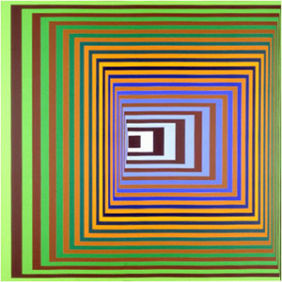
                                                              Vonal-Stri - Victor Vasarely 1975 Acrylic on canvas 200x200cm
2) Bridget Riley:
 Riley obtained strong black and white effects, for example in Blaze 2 (1963; Belfast, A.C. N. Ireland). Geometric units such as squares, triangles and circles were depicted in such ways that their distortions set up a definite rhythm. The optical spasms that result from this often allude to energy and to psychological phenomena, perhaps emanating from the unconscious. Later Riley moved away from the sharp contrasts of black and white, which created a fluctuating or ‘active’ space and strong light effects, towards tonal variation and eventually to colour contrast.
                                                            Bridget Riley, "Fragments" 1965

                                                                                                    Blaze 1964
Untitled 1964
                                                                  Fragment 1/7 1965

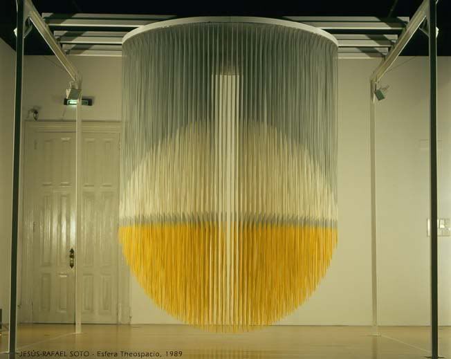
3) Jesús Soto:Soto’s research into optical vibrancy began in 1952 when he experimented with various chromatic and luminous elements distributed over the surface before he arrived at the moiré effect, which he favoured as a means of making solid objects such as wire structures appear to dissolve.


4)Yaacov Agam:  Agam similarly constructed works that depended on the spectators’ participation. He used musical terminology such as ‘contrapuntal’ and ‘polyphonic’ when naming his works. In this way he was trying to reach beyond the time-scale implicit in traditional music, regarding mere duration as infinitely less rich than the dynamic, irreversible and unforeseen quality of time that is involved in his transformable paintings. 


looking at layers, transparency, pattern

LOOKING AT THE USE OF A CORRUGATED SURFACE!
distorting the surface and messing with the viewer's perception


5) Carlos Cruz-Diez: colour in space and time....
In his Physichromies (from 1959) Cruz-Diez applied a theory of additive colours, combining a technique of regularly spaced card strips with earlier experiments with colour. He achieved a subtle interaction between the very intense reflections from the surfaces turned towards the spectator and the effects of expanding colour recorded upon the surfaces adjacent to the pigment. This allowed him in later environmental works to undertake an analysis of colour in confined spaces in order to induce successive situations that are themselves liable to give rise to chromatic events


6) Julio Le Parc:Le Parc and Morellet already had the development of a new visual situation as an ultimate objective; their interest lay exclusively in the object/eye relationship rather than in the object considered for its intrinsic plastic properties....etc


7) François Morellet.


Jump and Flow - Gilbert Hsiao


http://brenthallard.wordpress.com/2012/05/05/jump-and-flow-gilbert-hsiao/

Gilbert:  I was aware of op as a historical movement of course; I was an art history major at Columbia before deciding to move into fine art. And op is one of the most distinguishable styles out there. Even if it wasn’t around to be seen first hand (which it certainly wasn’t in the 1960s in the town of Terre Haute, Indiana where I grew up) its influence was everywhere; you didn’t have to go to a gallery or museum to experience it.


Talking about what effect Hsiao tries to create in his style of work.....

Brent: The World Clock and Inverted Memory are early pieces made in the nineties, with another, an even earlier painting, Composition with Four Black Squares and Four White Squares, made around the mid-eighties: these aren’t optical paintings in the sense there’s no overload and there are no illusionist shifts. The viewer is able to hold the visual information, while the flow remains relatively stable. How did you move from these early pieces to, say, a work like Revolver, which is dated 2007?
Composition with Four Black Squares and Four White Squares (1986), acrylic on canvas, 60″x 60″
                                                   Revolver (2006), acrylic on wood, 42″ x 42″
Gilbert:  Well it really depends on one’s definition of optical. A dictionary definition would say optical refers to either light or sight, which would at some level refer to all the visual arts. I think you’re using it in an art historical context here, referring to op art, what Time magazine referred to it asArt That Attacks the Eye when op was taking the country by storm. I think this is what you mean when you talk about the eye having the ability to hold information or not.
[Art: OP ART: PICTURES THAT ATTACK THE EYE
MAN'S eyes are not windows, although he has long regarded them as such. They can be baffled, boggled and balked. They often see things that are not there and fail to see things that are. In the eyes resides man's first sense, and it is fallible.
Preying and playing on the fallibility in vision is the new movement of "optical art" that has sprung up across the Western world. No less a break from abstract expressionism than pop art, op art is made tantalizing, eye-teasing, even eye-smarting by visual researchers using all the ingredients...]
Brent:  Okay, I was thinking in terms of op art.
Gilbert:  I have never thought in terms of the quantity of information that the eye can hold or that the mind can process. Nor do I want to attack anyone’s eye. I think more in terms of ways visual information can be organized with the goal of achieving a perceived experience that is pure and total but at the same time not static. From my earliest forays into abstraction in the early 80s, I was thinking in terms of making a static canvas appear to move, whether in terms of it moving across the surface (on an x and y-axis) or from front to back (on a z-axis). If I create this movement it would result in a viewing experience that would require the observer’s involvement over a period of time, much as the experience of listening to music requires time.
  • This desire to capture time has been consistent in my work; in that respect I don’t see a difference between my earlier work and my current work. What seem to be evolving are the shapes I am using as visual (or one could say musical) elements. 
  •  There’s a lot of figure/ground shifting that supplies them with much of their dynamism.  After 2000 or so I’ve worked almost exclusively with stripes. Revolver is an example of this.
  • The stripes allowed for the development of the shaped supports that evolved slowly over time, and which continue to do so.  I can’t imagine making a painting using square elements in a shaped support.

Brent:  I’m glad you mention ‘duration’. In painting, ‘time’ is a funny thing, just as the Z-axis is. Probably what I was suggesting is that the work approaching the nineties became faster, started to operate with retinal overload, along with the blurring of information. This, call it a hybrid system if you will, creates another entry into the experience.
Gilbert:  I would agree that there is accelerated blurring of information on an overall level that continues to this day. At the same time this accelerated blurring is highly controlled, although the results are not predetermined, as I never know how the end result will look until the tape is pulled off. It’s interesting that you allude to speed. I was not thinking about speed in the nineties; however it has been something I have become conscious of in the last three or four years.
Hybrid system – I’m not sure I’m clear what you mean by that but it sounds interesting.  Could you elaborate?
Brent:  Jump and flow I guess what I mean is what’s actually there and what we experience differs, or undergoes change, through the gears of perception
So looking at the ‘jump and flow’ of Go Off: the piece is shaped. It performs around that shape. The work doesn’t confuse with some other experience, though it could, I guess, given people’s imagination. The painting is itself, and this is the way it goes.
                                                           Go Off ( 2007), acrylic on wood
  •  During the 80s and 90s I was interested in movement described as ‘recalcitrant motion’ and ‘syncopation’. The paintings were an arena where the eye bounced around, sometimes repetitively, sometimes not. There was something cyclical about them.  I didn’t consciously leave that, and it’s still in my work, but a different kind of speed or acceleration has developed. More recent work demands more space around the physical painting; the eyes at times fly off the work and onto the surrounding walls.
  • Gilbert:  As far as visualization goes, I think I have an idea of what a piece will look like, which is why I begin it in the first place. The visualization has a lot to do with my memory and past experience of my work up to that particular point in time. As the piece develops, this visualization in my mind fades as the piece comes into being. 
COLOUR:

Color usually does not become a concern of mine until the first phase of the work is done, that is the black and the silver are done.  I visualize what color might achieve with the piece at hand and then proceed from there. The use of color totally changes the effect – the jump and flow, the grouping, the total perception of the work. So it’s a big decision whether to continue on with color, or to keep the piece without color.   The black, white and silver pieces have all been visualized with color, even if in the end I decided not to go down the color route.
Brent:  So – what you are saying is that you can do without the physical presence of color to give a sense of it?
Gilbert:  I’m saying that without the physical sense of color, a profoundly different sense of space is perceived. Black and white works oscillate between surface and infinity, while the use of color defines something in between.
To go back to your sound of the note analogy, it’s kind of like the difference between the sound of a note and the sound of a chord. A note is about a sound in space, followed by reverberations related to the note; it’s fleeting.
Color is more analogous to the chord: it complicates things with relationships of harmony or dissonance, and with overtones from each note that interact with one another; it has more punch and presence, almost a material being. Color creates tension. It creates relationships that arrest the mind or eye or whatever while those relationships are processed.
This is all determined by how we see; of course the cones in our eyes perceive color, while rods perceive movement and contrasts of light and dark. Take away the color element and the entire focus is on light, dark and movement.  So it follows that the black and white work is ‘speedier.’ Add color, and things slow down as the cones, which form the focal point of our vision, fire. The rods are located on the periphery, but there are many more rods than cones.
read more about perception of the viewer.....