Wednesday, 21 August 2013

Looking back at past works:

  •  revisiting past ideas
  • coming to the realization about the importance of these works in my current ideas and bringing their form back into my practice.
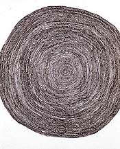
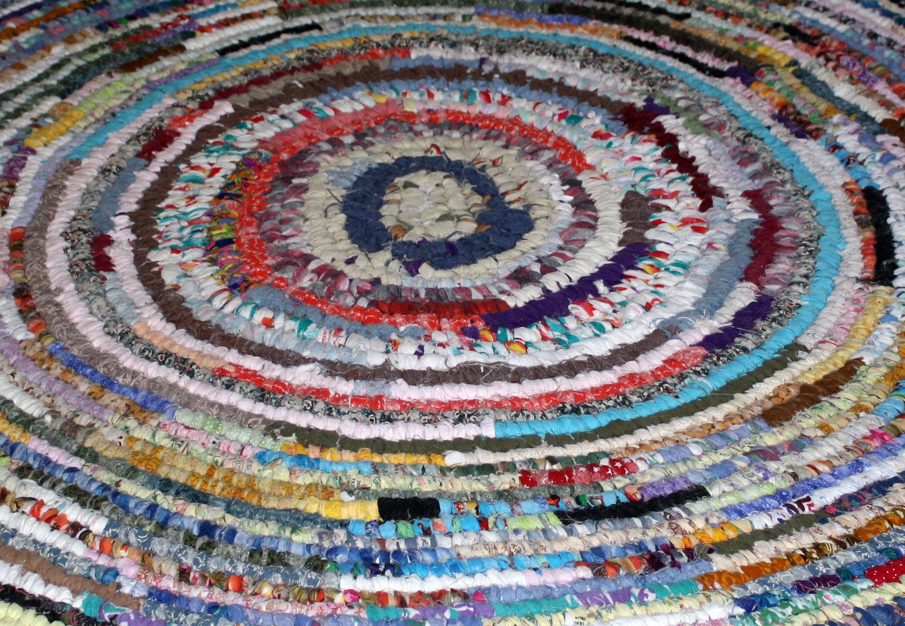
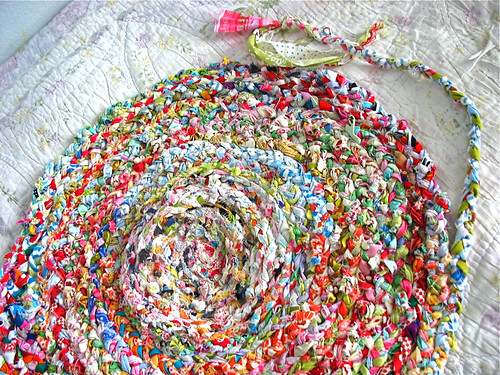
  • These works that I made around the time and for the yr2 pilot show have become interesting to me in terms of my new way of thinking about them....and how I can develop these works to further explore my idea of excess sensation through colour and movement.


My practice explores ideas of contiuous line, repetition, everyday materials, colour, and sensation:

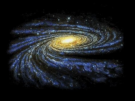
In my more recent works I have looked more closely at how these different elements in my work can combine to evoke different sensations in individual viewers. I am interested in how their brain can be saturated by the colour and emotion and drawn away from the intitail references to form that colour had trouble separating itself from in history. It is only in the last fifty years or so that artists have realised colours potential to be liberated from utility and thought of in its own right.

I am now also looking at creating disruptions in my pattern making using materials, and colour. I want to unsettle the rhythm and harmony of the work, throwing people out of complacency.

Begining of a new work:

 - subtle alterations in colour:


Monday, 19 August 2013

After reading : "The Painting Center Repetition and Discourse,"

New Artist:

  • repetition, line
  • "Simon Frost builds constellations of shapes out of layers of fine lines, creating intricate surfaces and imploding galaxies."
Untitled #32
2001
, Simon Frost
 
“Untitled #82” (2006), watercolor on paper, 8×8 inches.
 
                                                        "Untitled #150," 2008, Simon Frost


Interesting quotes from a book I found: An ABC for Grown Ups...

"Life Outside the Comfort Zone," Seth Godin

Quotes that have made me think more about my art practice and given me confidence in producing art and staying true to my ideas.
  • Anxiety is experiencing failure in advance. Tell yourself enough vivid stories about the worst possible outcome of your work and you’ll soon come to believe them. Worry is not preparation, and anxiety doesn’t make you better.
  • Commitment is the only thing that gets you through chasm. Commitment takes you from “that’s a fine idea” to “its done.” Commitment is risky, because if you fail it’s on you. On the other hand, without commitment, you will fail, because art unshipped isn’t art.
  • Effort isn’t the point, impact is. If you solve the problem in three seconds but have the guts to share it with me, it’s still art. And if you move ten thousand pounds of granite but the result doesn’t connect with me, I’m sorry calluses, but you haven’t made art, at least not for me.
  • Feedback is either a crutch or a weapon. Use feedback to make your work smaller, safer, and more likely to please everyone (and fail in the long run). Or use it as a lever, to further push you to embrace what you fear (and what you’re capable of).
  • Gifts are the essence of art. Art isn’t made as part of an even exchange, it is your chance to create imbalance, which leads to connection. To chare your art is a requirement of making it.
  • Heroes are people who take risks for the right reasons. Real art is a heroic act. Hipsters, on the other hand, are pretenders who haven’t risked a thing but like to play the part.
  • Initiative is the privilege of picking yourself. You’re not given initiative, you take it. Pick yourself. If you’re not getting what you want, it may be because you’re not making good enough art, often enough.
  • Joy is different from pleasure or delight or fun. Joy is the satisfaction of connection, the well-earned emotion you deserve after shipping art that made a difference.
  • More is not the goal of the artist. Better is the artist’s dream. Better connection is the point of the work. More stuff leads to a world of scarcity, while better connected creates abundance.
  • No feels safe, while yes is dangerous indeed. Yes to possibility and yes to risk and yes to looking someone in the eye and telling her the truth.
  • Pain is the truth of art. Art is a hobby or a pastime. It is the result of an internal battle royal, one between the quest for safety and the desire to matter.
  • Quality, like feedback, is a trap. To focus on reliably meeting specifications (a fine definition of quality) is to surrender the real work, which is to matter. Quality of performance is a given it’s not the point.
  • Remix, reuse, respect, recycle, revisit, reclaim, revere, resorb. Art doesn’t repeat itself, but it rhymes.
  • Vulnerable is the only way we can feel when we truly share the art we’ve made. When we share it, when we connect, we have shifted all the power and made ourselves naked infront of the person we’ve given the gift of our art to. We have no excuses, no manual to point to, no standard operating procedure to protect us. And that is part of our gift.
  • The Warranty of merchantability is a principle that guarantees that something you buy will do what the seller promises it will. Your work in art doesn’t come with one. Your art might not work and your career might not work either. If it doesn’t work today, it might not work tomorrow either. But our practice is to persist until it does.
  • Youth isn’t a number, it’s an attitude. So many disruptive artists have been youngsters, even the old ones. Art isn’t a genetic chronological destiny, it’s a choice, open to anyone willing to trade pain in exchange for magic.


New installations:

  •  Thinking about the space that I place these intense works in: giving them room to illuminate the space around them, focus on the intensity of colour (separating colour from objects), and allowing them to radiate and hover off the ground.
  • I want to also explore different colour combinations and sensations: joyful, exciting, sickly, dull, boring, overwhelming etc.
  • I also plan to try placing them on every floor in the art department as surprising discoveries of sensation for the viewer. Presenting a condense, compact mass wool ( an everyday/familiar) material that speaks to the viewer beyond just the material and into a world of system, rhythm and order of pattern and colour. There is an intensity in each work that brings about these sensations and I often try to work with introducing chaos amongst the rhythm and movment, using a variety of colours and surprising colour relationships.


From one of my annotated bibliography readings:


The power of colour (excess and intensity)

  • Colour in nature: used for reproduction, attraction of the females
  • Helps use to be aware of our surroundings
  • Historical conventions - green = go, red = danger etc.


Saturday, 17 August 2013

Most Recent works/developmenmts after meetings with levturers:

  • colour, excess and intensity
  • pulsating (eg. in the button work I am following a similar spiral/ vortex system but the sizes and shapes of the buttons are causing a pulsating effect where the simple spiral is messed with and this brings about the sensation of pulosating on the viewers vision and puts the vortex out of whack.)
  • pattern, system, control
  • gesture
  • everyday material - choice guided by colour, my knowledge of the material when working with it previously - aware of the intenisty I could create when spiralled together.


Meeting with Ian Jervis: COLOUR

  • Telling a story - Focus on a rich topic of interest
  • Effect on the brain: Visual process + focal point of retina, psychology of colour, colour = litterally the center of our point of focus
Colour in the Everyday:
  • Don't often notice it when it is dispersed throughout the world / in daily life - splashed around like little trinkets of colour catching your eye eg. to buy things in shops.
  • Helps us identify things in life - brand colours
  • Natural world - reproduction (eg. flowers), territorial display, warning signs - danger.

  • Historical conventions: In our memory to respond to these colours the way we do:
  • eg red - avoid, danger/hazard, green - go, safe
  • The idea of memory recognition may help when considering what colour choices to make for my works.
  • We see colour before we see tone.
  • Shadow helps us identify form

  • Could colour break away from/ out of utility? (utility - usefulness, value, effectivness)
  • Colour has the ability to liberate - liberation form utility
  • Excess - like icing on the cake
  • Like the mass of everyday materials I am using in my work, colour can work in the same way when presented in excess it has the ability to be effective/high impact and get noticed by the viewer.

Colour: High energy
  • Saturates the brain when faced with excess colour.
  • Stops us form thinking
  • Power of colour - worthy to play with beacuse it is liberating.
  • Colour avoids a direct narrative - more about SENSATION
  • tonal work speaks more of narrative
  • Excess + Endulgence
  • Power + control
  • Change and Exploration
  • Decoration + excess
  • Colour - lively, excitement or boredom, excess/ overload etc
  • Choose one aspect and write a story - lead with one idea - the power of colour in excess
  • Excess : how to talk about it.....
  • Think about my work and make notes while lookign at it - why the work is interesting and its effect on me/ what am I trying to do in terms of sensation and impact?
  • This will in turn effect how I go about making future works and how I think about my approach to materials and colour choices....I will understand what to do next.
  • Dealing with the work on its own terms

  • Breaking away from utility...
  • disrupting, fun, change, randomness, surprises, questions, disturbing...
  • Looking at designers who have pushed the boundaries of what is acceptable/ normal...
  • Messing with/ fucking up beauty..: their work may be stiking, offensive, violent etc...
  • Throwing people out of complaicency
  • Stepping away from order and chaos ( may also look at the effect of this) and working more with confusing and disrupting the viewer - stressful, chaotic, disrupted
  • Colour has the power to disrupt order rhythm and systems: Can work with visual effect of decoration but use colour to make subtle/ abrupt disruptions
  • Causing nausea, unable to settle, shifting, movement - Excess of sensation through colour and movement.
  • Adolf Loos - "Decoration is a crime" eg. decorative furniture pieces ontop of the towns buildings - pointless, pointing fun at this idea, joke.

Decorative:
  • Suggests sensations/ atmosphere - harmony, dissonance (discord, conflict.....syn. harmony) - gives adreniline which is addictive.
  • Ties in with rhythm and colour - predictability - colour can mess this up.
  • Achromatic: competing with colour - irritation, interesting, method - decoration, rhythm, repetition.
  • Throwing these patterns, rhythms and systems out of wack - aesthetic becomes anaethetic..
  • Kitsch: two refusals t bring in oppotion
  • Compared to normal which is good taste - socio economic status (aesthetics, subtlty..)

Judy Darrough
  • Shows at 'Two Rooms Gallery."
  • Queen of Kitsch - dissonance
  • Looking at the aesthetics of what other people deal with in the everyday - buying for the use of the object/item rather than its colour
  • Darrough works with this idea and gets the viewer to reconsider these aesthetics - putting random things/ colours together creating humour, surprise, change and excitement.


Wednesday, 7 August 2013

Meeting with Mon J:

  • Be more sensitive to the materials  - Sticking to the ones I have already been workign with, pushing my relationship with these materials (wool, beads), to really explore and understand their material qualities.
  • How can masses of found beads and wool be used?
  • Wound together, platted (rag rugs), coiled
  • look at colour relationships


  • Need to focus more on refining my works/ developing a stronger understanding of what that materials I have chosen can do.
  • The different qualities of the wool (fluffy, thick, thin, stiff floppy), beads (size, shape, beads or buttons?)
  • Considering different constructions - using thin wire, string, nailing them to the wall, glue...
  • Space: on the wall, on a surface, on the floor...
  • working in the centre of a space rather than responding to the corner of a wall...looks more at materials qualities and what I have opened up about that material.
  • Need to make make MAKE!!!!

COLOUR!!
  • Distinct colour choices - order, pattern, combinations, repetition.
  • Go with the flow of these patterns - see how the work develops over time and the choices that I make as the work progresses.
  • TALK TO IAN JERVIS!

BOOKS:
Colour
  • White Chapel Series - there is one on colour, painitng...etc.
  • My old colour articles....
Line
  • "Singular Lines Sometimes Repeated"
  • "Infinite Line"
Labour
  • "Work Ethic" (catalogue) - If I cannot find it Mon has a copy

 Look at my old documents, books, articles of choice...

Artists:
  • Nike Sivalis - cotton wool balls - sequence, repetition
  • David Sequiera - uses everyday materials
 
 
http://www.iconophilia.net/in-the-air/ - lookign up close at some colour works made with plates and trays.
 
 
David Sequeira (1966-) Zen Picnic (1998-2006) (Collection of the artist)
 
Look at groups of articles on artists Germaine Koh (Knit work) and Tiffany Singh


Notes from my meeting with Tri Scott:

  • When choosing materials to work with often the most interesting relationships you can make are with materials are ones where you don't fully trust that material....
  • Makes you feel uncomfortable
  • Easy/difficult to express these feelings
  • Being a function with a material
  • LOVE is very important when dealing with a specific material - you get closer to it, expressed through you choice of gesture/interaction, bodily experience.
  • A successful work is one where the viewer can respond to the love and attention you have payed to this particular material, and a work that you yourself are proud of.
  • We choose ceratin materials to work with becasue we cannot resist them.
  • It is a personal/physical choice and we need to allow our mind to go for the ride.
  • RHYTHM: these works can become musical and rhythmic through the fluid interaction and repetition of gesture.
  • You start to understand the material with your body and mind.
  • In a physical and spatial way.
  • Realise simple things eg. Gravity - the physical world.
  • When DOING you gain more of an appreciation for that material.
  • Forming connections/ making sense of something/ feeling your way into the relationship.
  • You learn to understand somthing really simple in a more profound way.
  • Grasped something, and it becomes a part of you to understand that.
  • The drawing process: Touching on things without pinning them down.
Serindipity (feeling sensation, magical, an aptitude for making desirable discoveries by accident, the faculty of making fortunate discoveries by accident)
  • Looking for little things that strike me.
  • Possibility of moments
  • Looking for things that jump out at me - Litterally light up in my eyes.
  • Looking at it and knowing an characterisitic of that material, something you can do with it.

  • Putting these feelings into words is difficult.
  • You can see them inside oyurself
  • Just like memories from the past these relationships (bodily) are similar, they are embedded in you
  • Memories/ decisions come out of your body, they come out in a different physical form.
  • These material relationships/ interactions are an interesting way of knowing.
  • You can set aside the knowing of you ind and a different space opens upwhich is more inarticulate/ more bodily/ clearer to you on a physical, more personal level.
  • Understanding something about something
  • It becomes tangible - you gain a deep knowing.
  • Have CONFIDENCE
  • The world - Every molecule has a vital energetic place: we are these molecules so we need to change and gropw and do our own thing.
Further decelopments/ things to do...
  • Finding more poetic writings - simple but meaningfuland captures ideas in a cocise way.
  • Collecting phrases/ Pinterest (notes and images) - Gain more experience of these found images and phrases by making work that incorporates/ responds to them..
  • Try works I do in relationship to space and dwellings
  • Pay more attention to the space I am working in, thinking about corners, cupboards or even excluding things (on purpose).
  • BOOKS: The Man Who Tasted Shapes"......."The Poetics of Space," by Gaston Bachelard.
  • Louise Bourgeois