Ok. So it has been very long time since my last post ...woopsie.
I have been on many adventures since uni including, four months of travel through europe, and now I live in the wonderful but crazy London.
Even though I did not blog during this time I have kept my passion for art along the way. The stunning scenery and continuously changing culture of each town that my boyfriend and I visited really took my breath away.
I still have a ongoing interest in a mixture of vibrant colours, black and white and intense pattern. I am interested in capturing memories of my own throughout my travel and using colour and pattern to express how I felt at that moment. Whether I work over the top of photographs, or pluck an image straight from memory, each piece will deepen the viewer's understanding of how I felt at that moment.
Some techniques that I am very interested in are:
- Mandala patterns
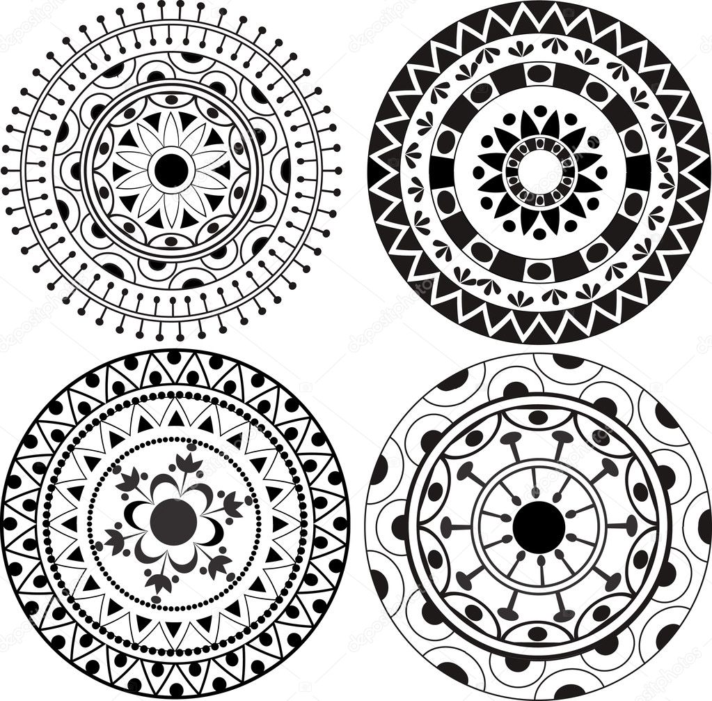
- Henna
Henna drawing
Artists (I will add some others later)
- Marian Maguire - black and white, positive and negative
Tuesday, 28 April 2015
Wednesday, 6 November 2013
Adding more to my final installation:
Daniela Vulinovich, "Untitled," November 2013, vinyl, 580mm x 580mm
Installation views:
The real focus of this installation was to create an
environment in which each work can buzz and pop individually . Simple collisions
of everyday colours and the selective
placement of different surface and mediums create relationships between each of
the works, bringing to together as a whole installation.
The intensity of colour, pattern and texture together have created an overload
of sensual experiences for the viewer.
Final exhibition photos:
Daniela Vulinovich, "Untitled," October 2013, plastic plate, wool, 360mm x 360mm x 160mm
Daniela Vulinovich, "Untitled," October 2013, fluorescent orange felt, blue wavy ribbon, polystyrene ring, wool, left: 160mm x 250mm
Daniela Vulinovich, "Untitled," October 2013, plastic plate, wool, 360mm x 360mm x 160mm
Daniela Vulinovich, "Untitled," October 2013, ribbon, polystyrene cone, 550mm x 170mm x 170mm
Note: photo is meant to be vertical.
Installation View
Daniela Vulinovich, "Untitled," November, 2013, corrugated plastic, stripped material, vinyl, 1300mm xmm750mm x 15mm
Daniela Vulinovich, "Untitled," October 2013, polystyrene, wool, fluffy material, 470mm x 470mm x 55mm
Daniela Vulinovich, "Untitled," November 2013, orange felt, green wavy ribbon, optical patterned material, bean bag filler, 1100mm x 900mm
Note: image should be vertical.
Daniela Vulinovich, "Untitled," October 2013, vinyl, 580mm x 580mm
Daniela Vulinovich, "Untitled," October 2013, corrugated plastic, wool, 355mm x 422mm x 15mm
Installation view
Daniela Vulinovich, "Untitled," November 2013, artist's finger line, 360mm x 530mm x 30mm
Daniela Vulinovich, "Untitled," November 2013, wool, 1300mm x 1300mm
Installation viewer
Tuesday, 5 November 2013
Closer to final installation:
It was said to me by one of my friends doing their masters that I should focus on following my gut!
This installation has been quite difficult for me as a yr 3 student who has not had much experience with a larger area, that could almost be its own room. I want to create an environment where all of the works can buzzy and pop individually. I have given them with enough space to give the viewer individual experiences but also make links between works with colour combinations and a balance of height and space between them all.
Testing installations:
- trialling different colour combinations in relation to forming my own colour complexities and a senses of disorderliness or completion, harmony etc.
this work as an illusionary effect against the white walls. The shiny surface of the ribbon coated cone reflects onto the white creating a buzzy eye teasing experience.
I am still questioning my instalment of this work...I feel that it needs to be catered to more, as currently it is just material placed over a surface and I personally am interested in the effect but the to feel satisfied I need to place more care into creating an effective work with excess sensation.
Sunday, 3 November 2013
Potential ideas:
senses through an overload of single colour....
http://www.colormatters.com/color-and-vision/color-and-vision-matters
senses through an overload of single colour....
http://www.colormatters.com/color-and-vision/color-and-vision-matters
The human eye can see 7,000,000 colors. Some of
these are eyesores. Certain colors and color relationships can be eye
irritants, cause headaches, and wreak havoc with human vision. Other colors and
color combinations are soothing. Consequently, the appropriate use of color can
maximize productivity, minimize visual fatigue, and relax the whole body.
Which color is the most irritating?
Yellow, pure bright lemon yellow is the most
fatiguing color. Why? The answer comes from the physics of light and optics.
More light is reflected by bright colors, resulting in excessive stimulation of
the eyes. Therefore, yellow is an eye irritant. Some claim that babies cry more
in yellow rooms, husbands and wives fight more in yellow kitchens, and opera
singers throw more tantrums in yellow dressing rooms. However, these
reports have not been scientifically proven.
In practical application, bright yellow - when used in large areas, will irritate the eyes. Therefore, do not paint the walls of an office (or any critical task environment) yellow. Note: Lighter shades of yellow can be comforting and cheerful.
Also, beware of bright yellow legal
pads (but this may give you a jolt and temporarily wake your brain up)
and do not use yellow as a background on your computer monitor.
On the other hand, since yellow is the most visible
color of all the colors, it is the first color that the human eye notices. Use
it to get attention, such as a yellow sign with black text, or as an accent.
Have you noticed yellow fire engines in some cities?
Finally, yellow is a wonderful color, the most
cheerful of the spectrum. And yellow is a symbol of the deity in many global
religions.
Some tips for practical application:
Notice the difference between a yellow of the purest intensity and a softer tint. Also the size of the area that any color occupies determines the color effect. For best results, use softer tints of the hue or small quantities. A little bit of color goes a long ways.
Subscribe to:
Posts (Atom)


